Appearance
Line
The Line component allows you to render simple yet customizable vertical and horizontal lines within your layout.
These lines can serve as visual dividers, helping to structure and improve the readability of your content. You can specify the thickness of the line and optionally customize its color.
Vertical
Renders a vertical line with a specified thickness.
csharp
container
    .Row(row =>
    {
        row.AutoItem().Text("Text on the left");

        row.AutoItem()
            .PaddingHorizontal(15)
            .LineVertical(3)
            .LineColor(Colors.Blue.Medium); // optional

        row.AutoItem().Text("Text on the right");
    });
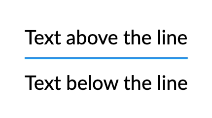
Horizontal
Renders a horizontal line with a specified thickness.
csharp
container
    .Column(column =>
    {
        column.Item().Text("Text above the line");

        column.Item()
            .PaddingVertical(10)
            .LineHorizontal(2)
            .LineColor(Colors.Blue.Medium); // optional

        column.Item().Text("Text below the line");
    });
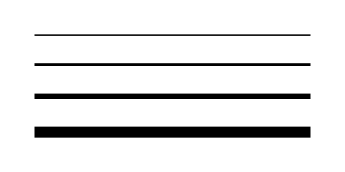
Thickness
It is possible to modify how pronounced the line appears by adjusting its thickness.
csharp
container
    .Column(column =>
    {
        column.Spacing(20);

        foreach (var thickness in new[] { 1, 2, 4, 8 })
        {
            column.Item()
                .Width(200)
                .LineHorizontal(thickness);
        }
    });
Solid Color
Specifies the color for the line.
csharp
container
    .Column(column =>
    {
        var colors = new[]
        {
            Colors.Red.Medium,
            Colors.Green.Medium,
            Colors.Blue.Medium,
        };

        column.Spacing(20);

        foreach (var color in colors)
        {
            column.Item()
                .Width(200)
                .LineHorizontal(5)
                .LineColor(color);
        }
    });
Gradient
Applies a linear gradient to a line using the specified colors.
csharp
container
    .Column(column =>
    {
        column.Spacing(20);

        column.Item()
            .Width(200)
            .LineHorizontal(5)
            .LineGradient([Colors.Red.Medium, Colors.Orange.Medium]);

        column.Item()
            .Width(200)
            .LineHorizontal(5)
            .LineGradient([Colors.Orange.Medium, Colors.Yellow.Medium, Colors.Lime.Medium]);

        column.Item()
            .Width(200)
            .LineHorizontal(5)
            .LineGradient([Colors.Blue.Lighten2, Colors.LightBlue.Lighten1, Colors.Cyan.Medium, Colors.Teal.Darken1, Colors.Green.Darken2]);
    });
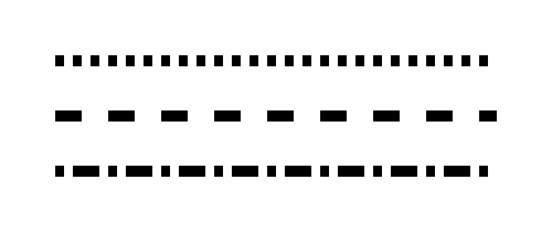
Dash Pattern
Configures a dashed pattern for the line.
For example, a pattern of [2, 3] creates a dash of 2 units followed by a gap of 3 units.
WARNING
The length of the pattern array must be even.
csharp
container
    .Column(column =>
    {
        column.Spacing(20);

        column.Item()
            .Width(200)
            .LineHorizontal(5)
            .LineDashPattern([4f, 4f]);

        column.Item()
            .Width(200)
            .LineHorizontal(5)
            .LineDashPattern([12f, 12f]);

        column.Item()
            .Width(200)
            .LineHorizontal(5)
            .LineDashPattern([4f, 4f, 12f, 4f]);
    });
Complex Example
It is possible to combine multiple options to create a more complex line style.
csharp
container
    .Width(300)
    .LineHorizontal(8)
    .LineDashPattern([4, 4, 8, 8, 12, 12])
    .LineGradient([Colors.Red.Medium, Colors.Orange.Medium, Colors.Yellow.Medium]);