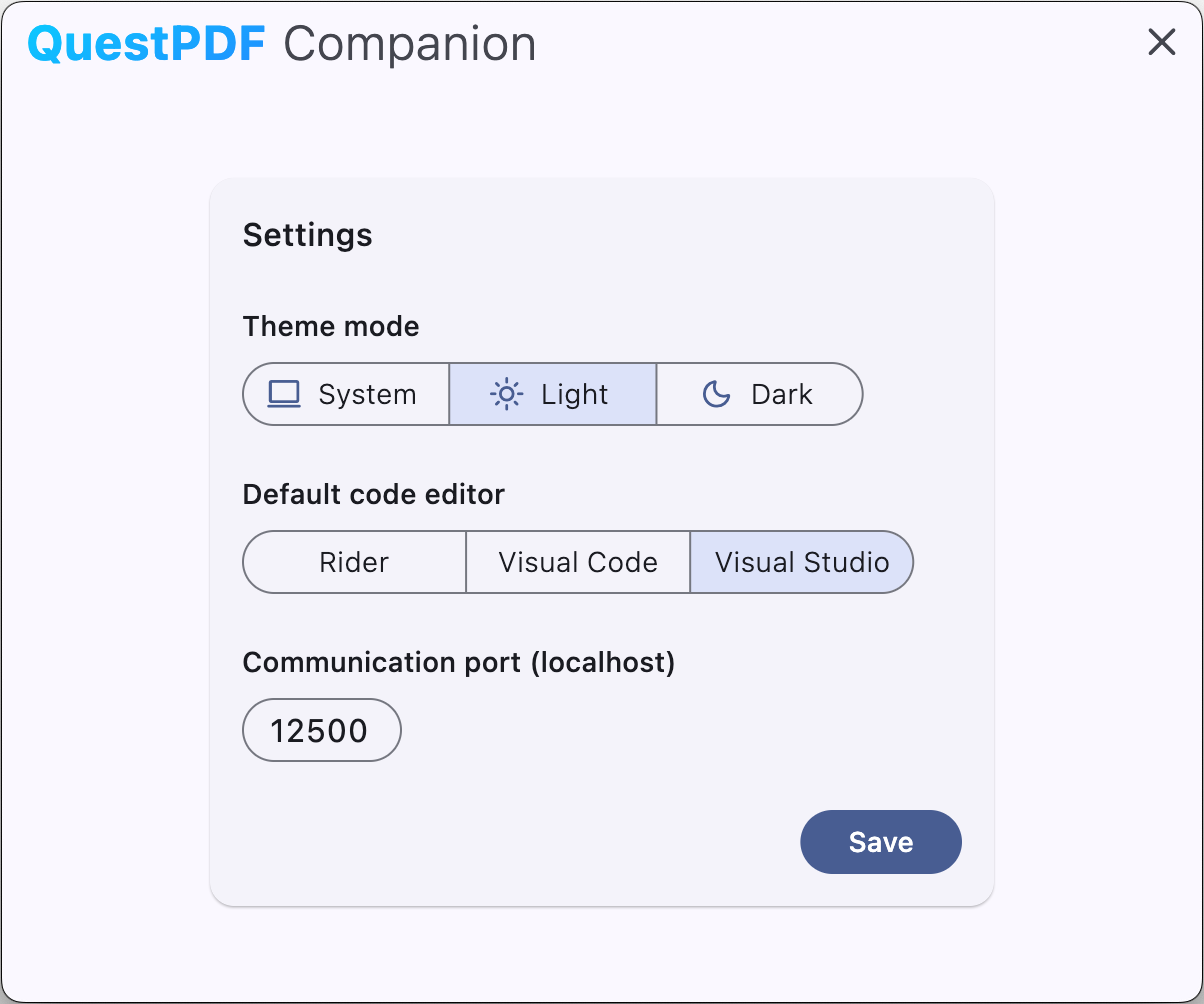
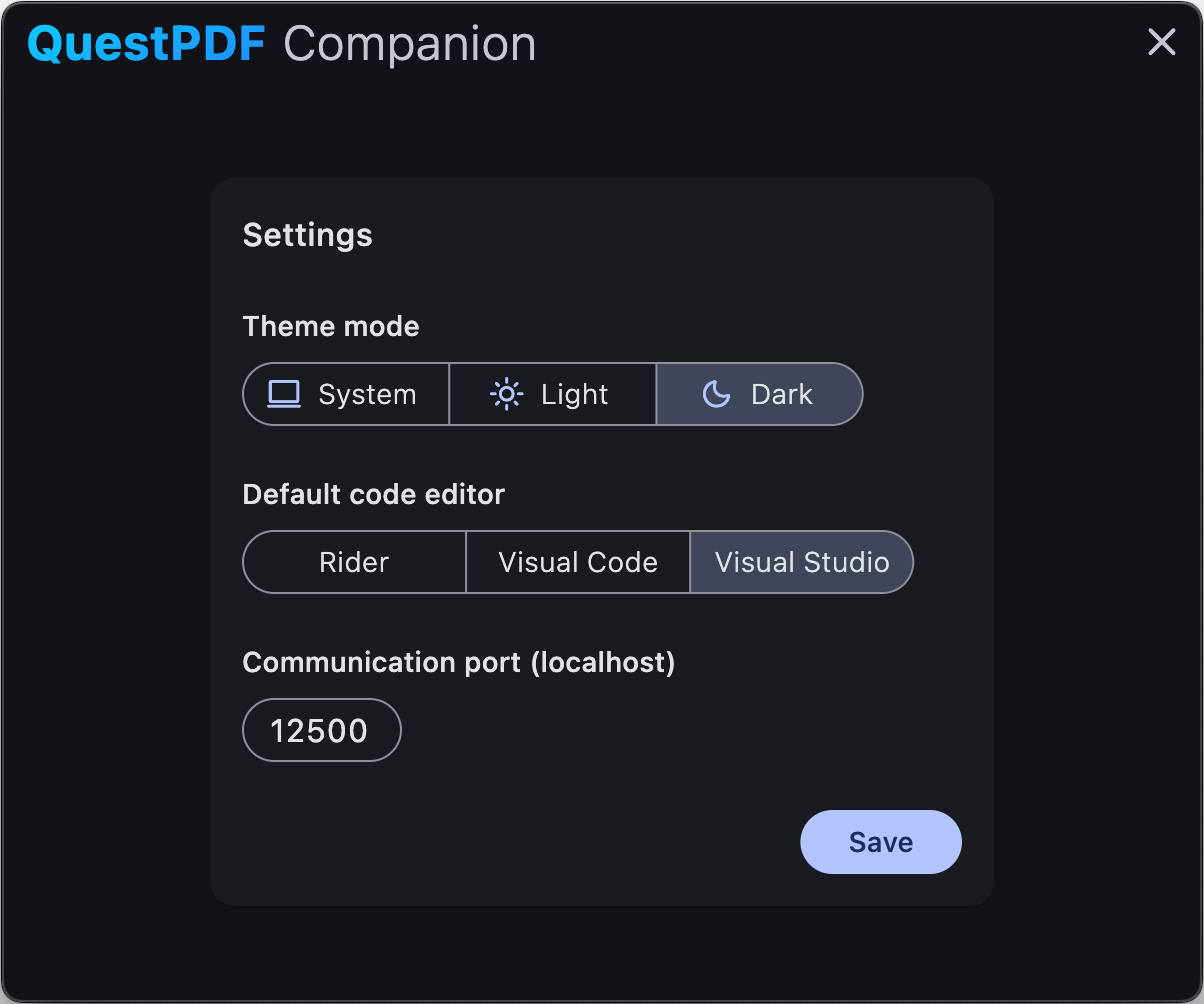
Appearance
Companion: Features
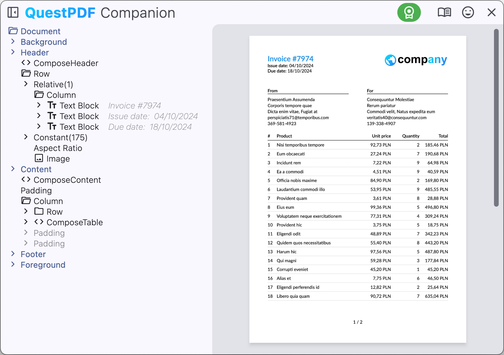
The companion app provides a preview of the document. The preview is interactive and allows you to navigate the document, select elements, and measure distances.
Document hierarchy
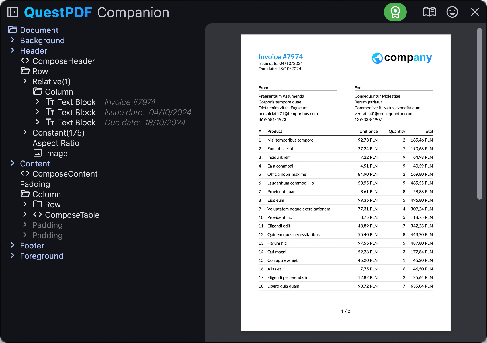
Document hierarchy is a tree structure that represents the document content. The hierarchy is displayed in the left panel of the companion app. The hierarchy allows you to quickly navigate the document content and select elements.
The tree-structure uses a similar compact concept as C# Fluent API. Each node in the hierarchy represents an element in the document. Please note that certain API calls may produce more advanced hierarchy structures. The hierarchy is interactive, and you can expand and collapse nodes to navigate the document content.
| Shortcut | Description |
|---|---|
| ctrl + W | Hide / show document hierarchy |
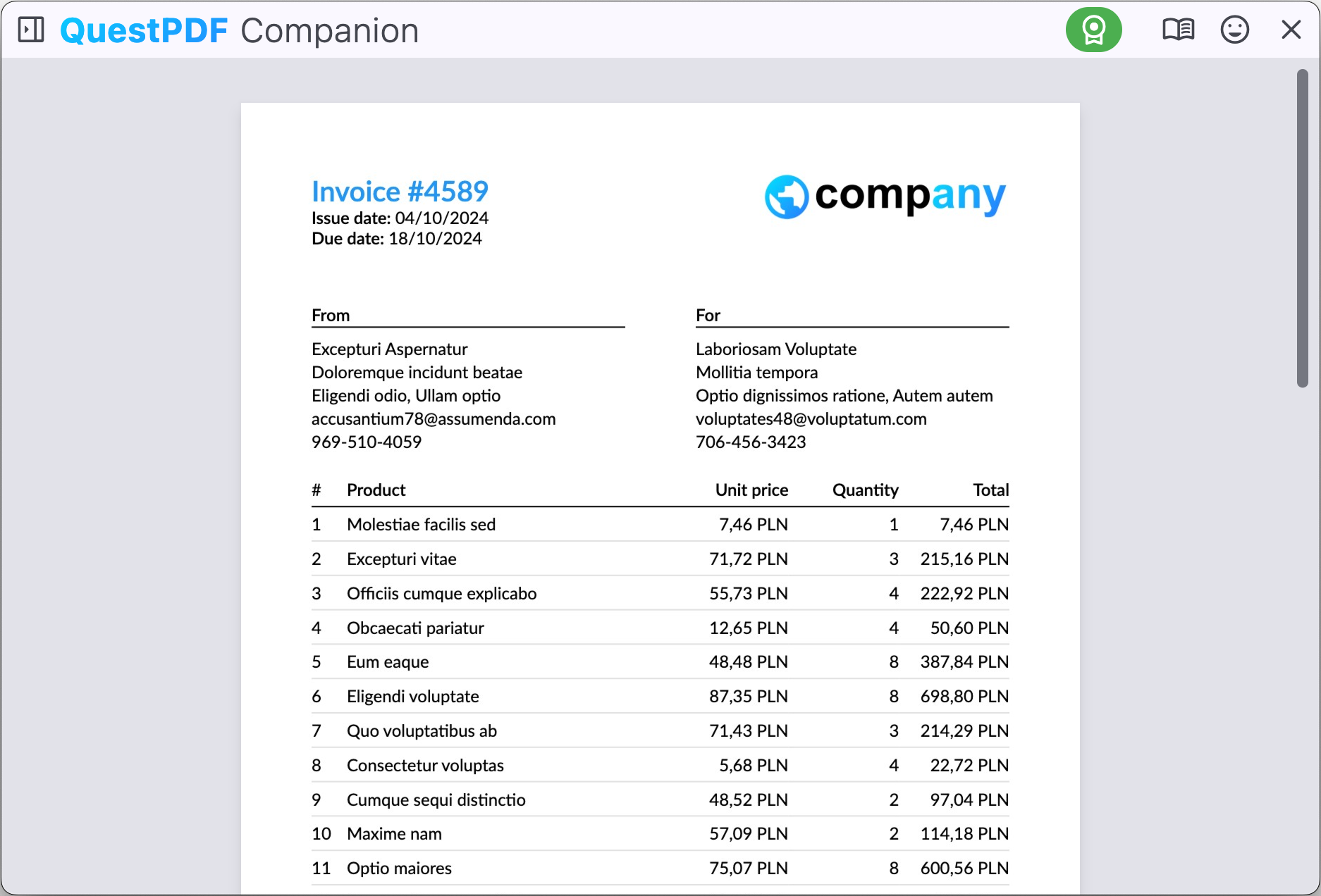
Document preview
The document preview section (on the right side of the screen) displays the document content. You can interact with the preview in many ways, such as moving the preview, zooming in and out, and measuring distances.
| Shortcut | Description |
|---|---|
| click and drag | Move preview |
| scroll wheel | Scroll vertically |
| shift + scroll wheel | Scroll horizontally |
| ctrl + scroll wheel | Zoom |
| 1 | Magnifier |
| 2 | Show coordinates |
| 3 | Measure vertically |
| 4 | Measure horizontally |
| double click | Select element |
| alt + click | Open link (hyperlink or section link) |
| ctrl + click | Show implementation of selected area in code editor |
| ctrl + E | Fit entire page on the screen (hover cursor over target page) |
Magnifier
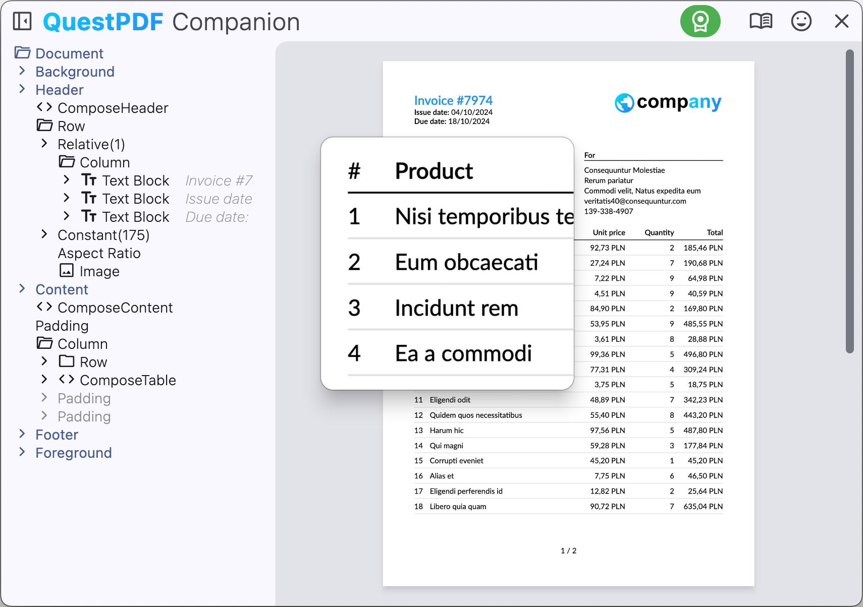
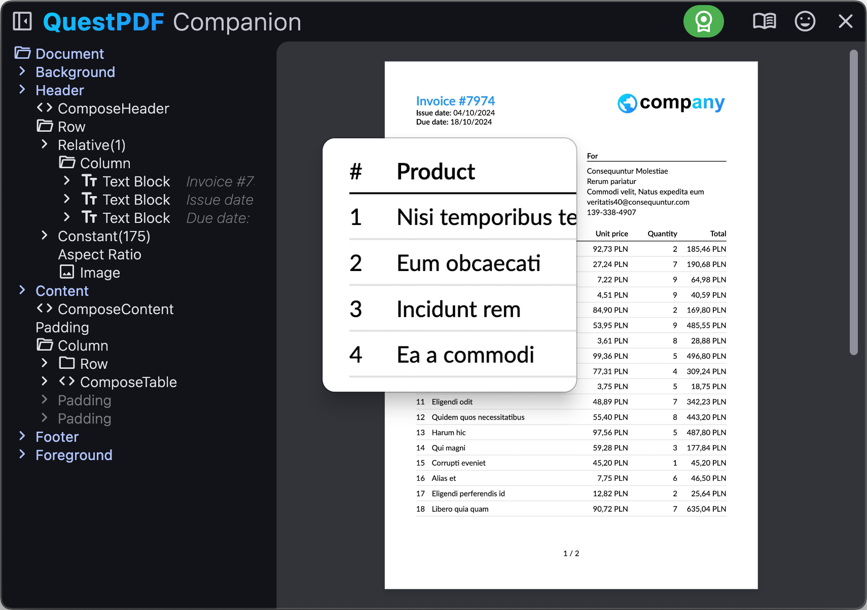
Use the magnifier feature (shortcut: key 1) to quickly see document's structure details without the need of zooming and adjusting the preview.
Coordinate picker
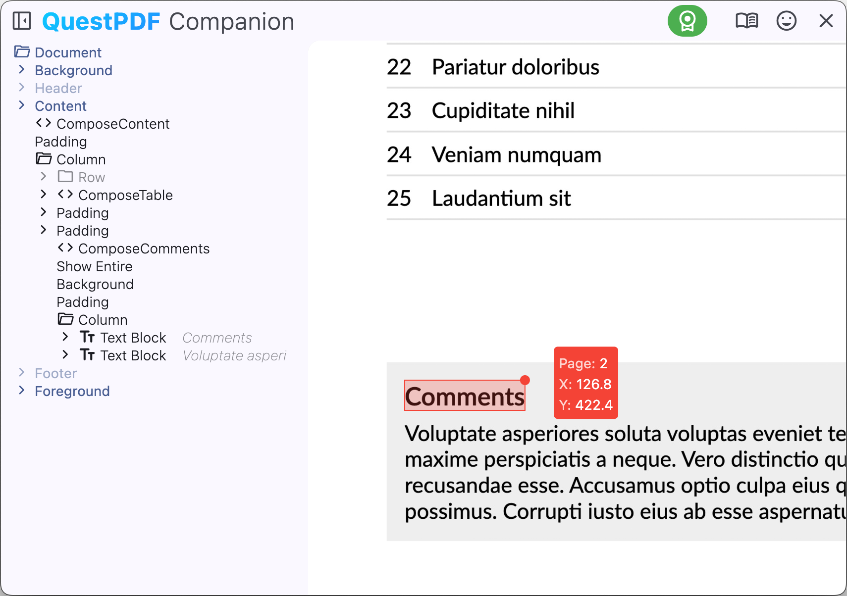
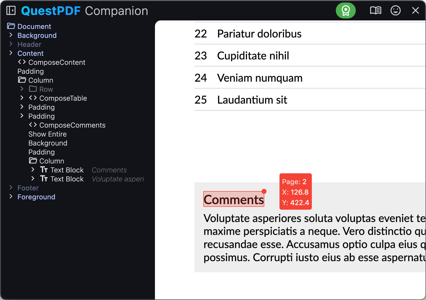
The coordinate picker feature (shortcut: key 2) allows you to pick the coordinates of the selected element. This feature is useful when you need to know the position of an element in the document.
Size measurement
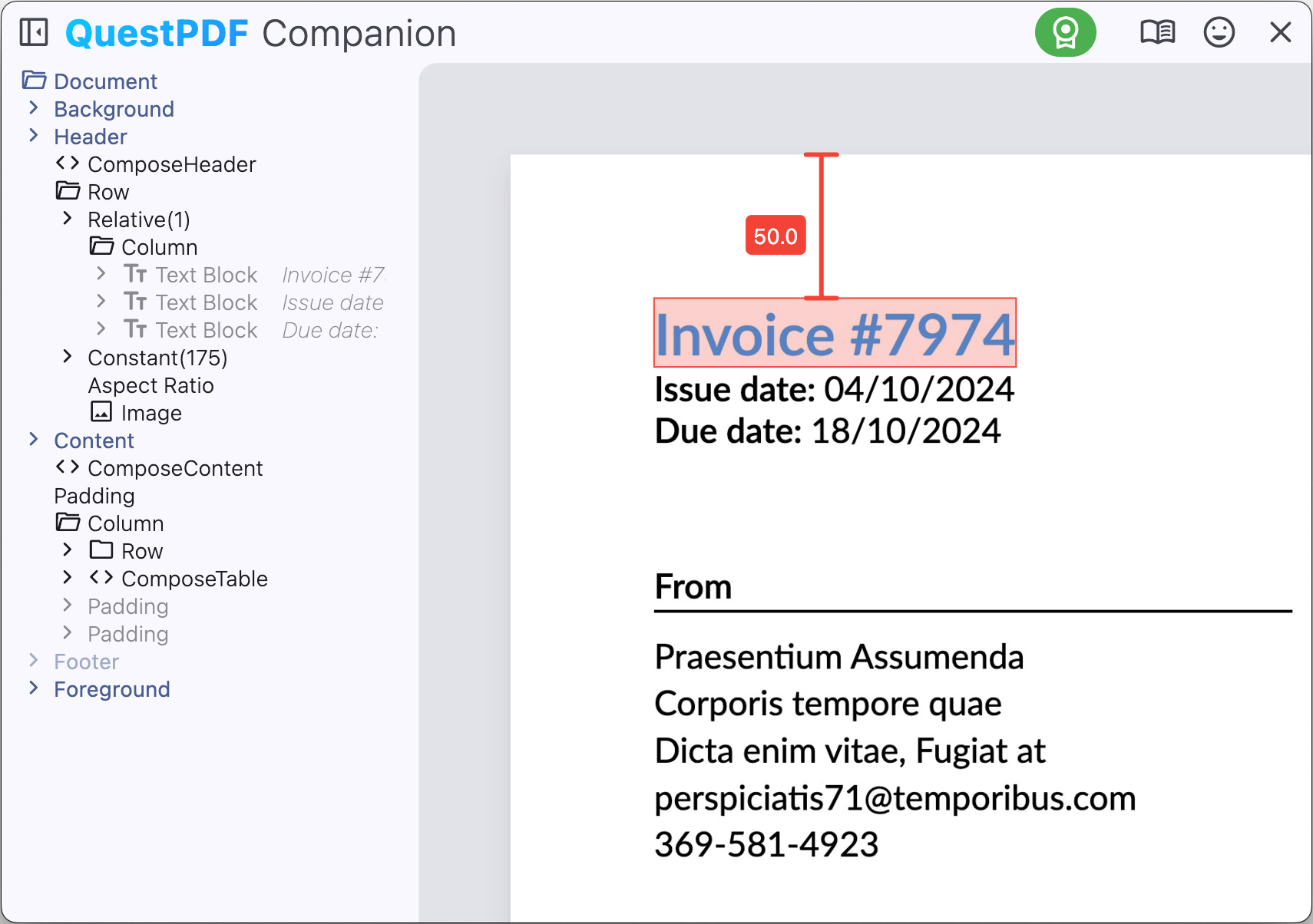
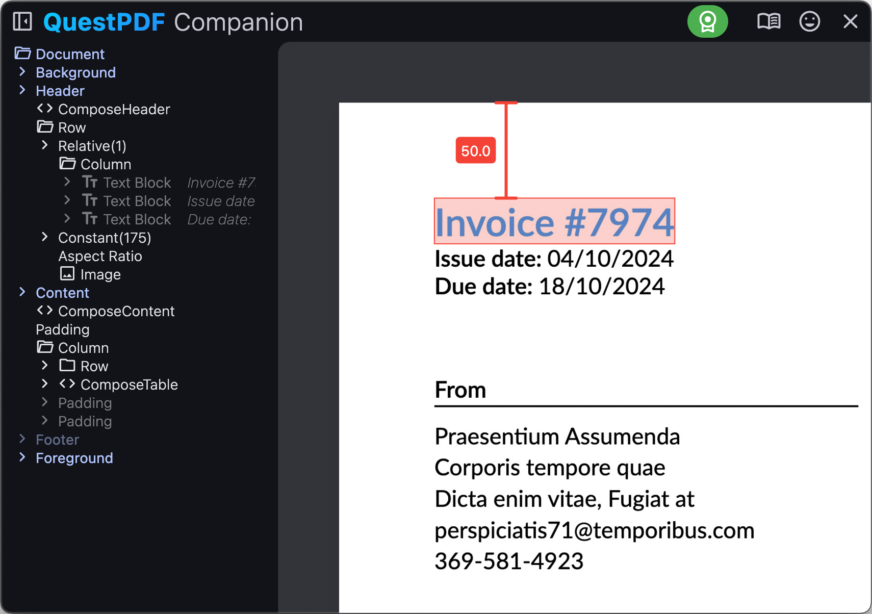
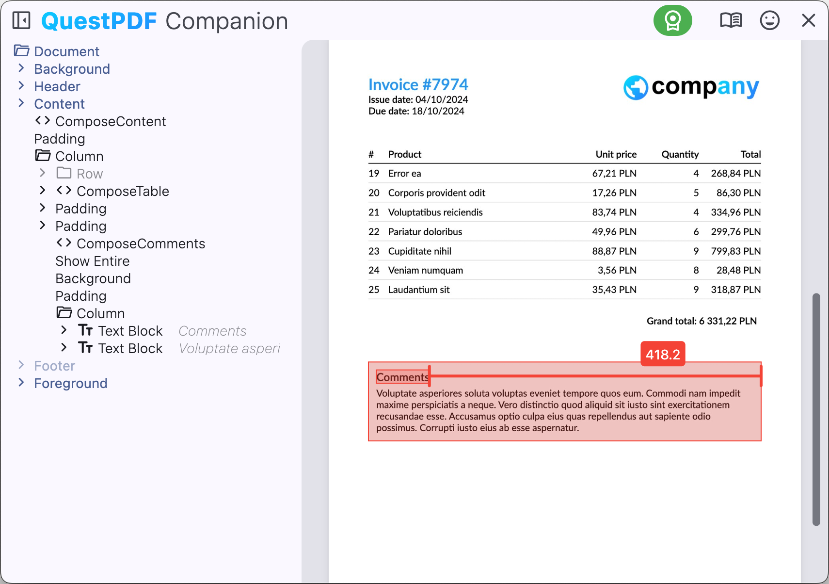
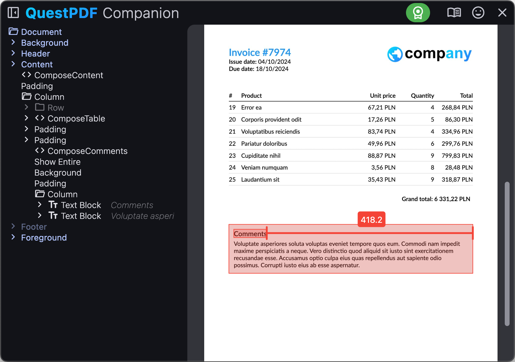
This feature allows you to measure the size of visual elements in the document, as well as the distance between elements.
You can measure the size of the content vertically (shortcut: key 3) or horizontally (shortcut: key 4).
Element selection
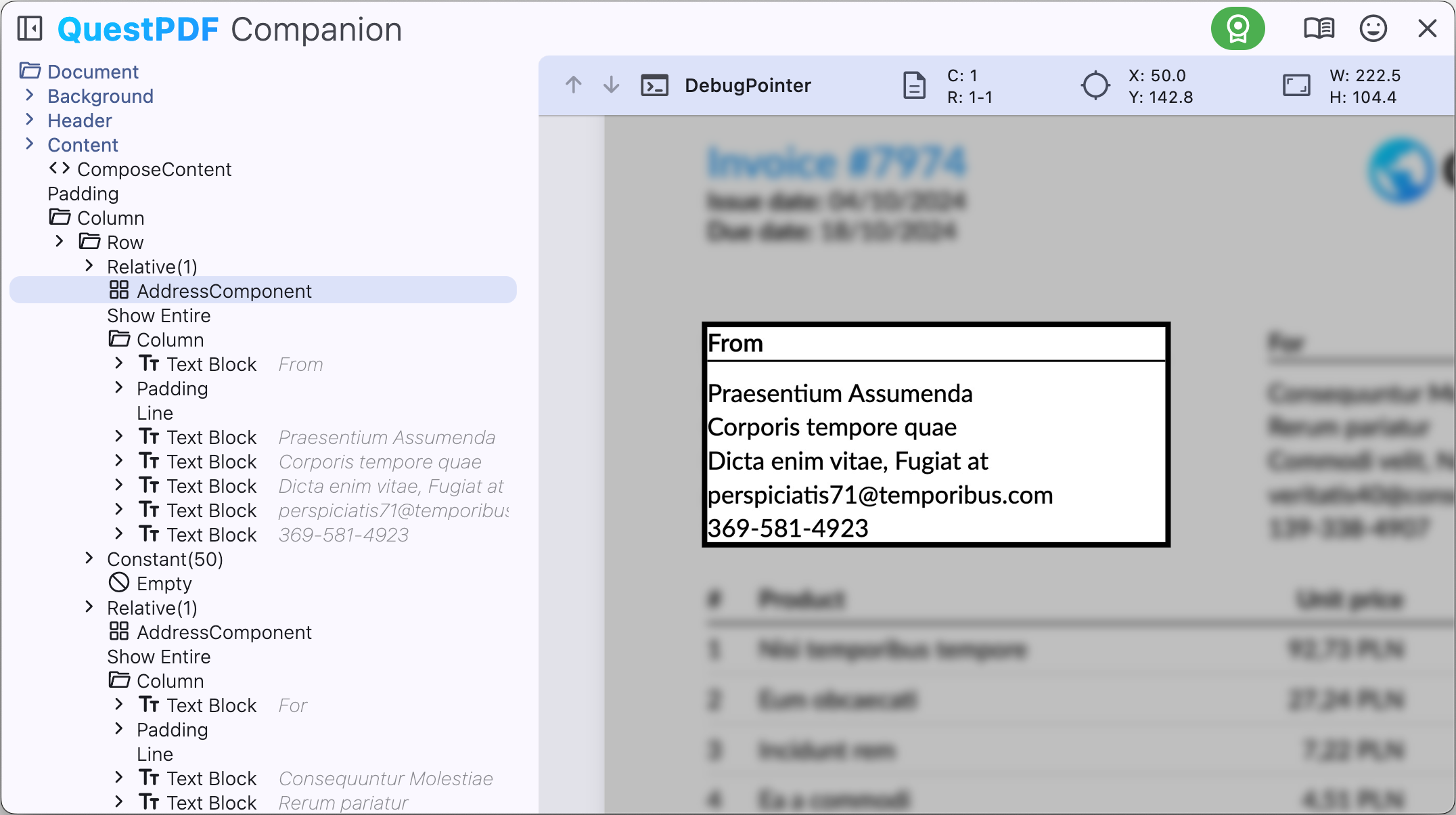
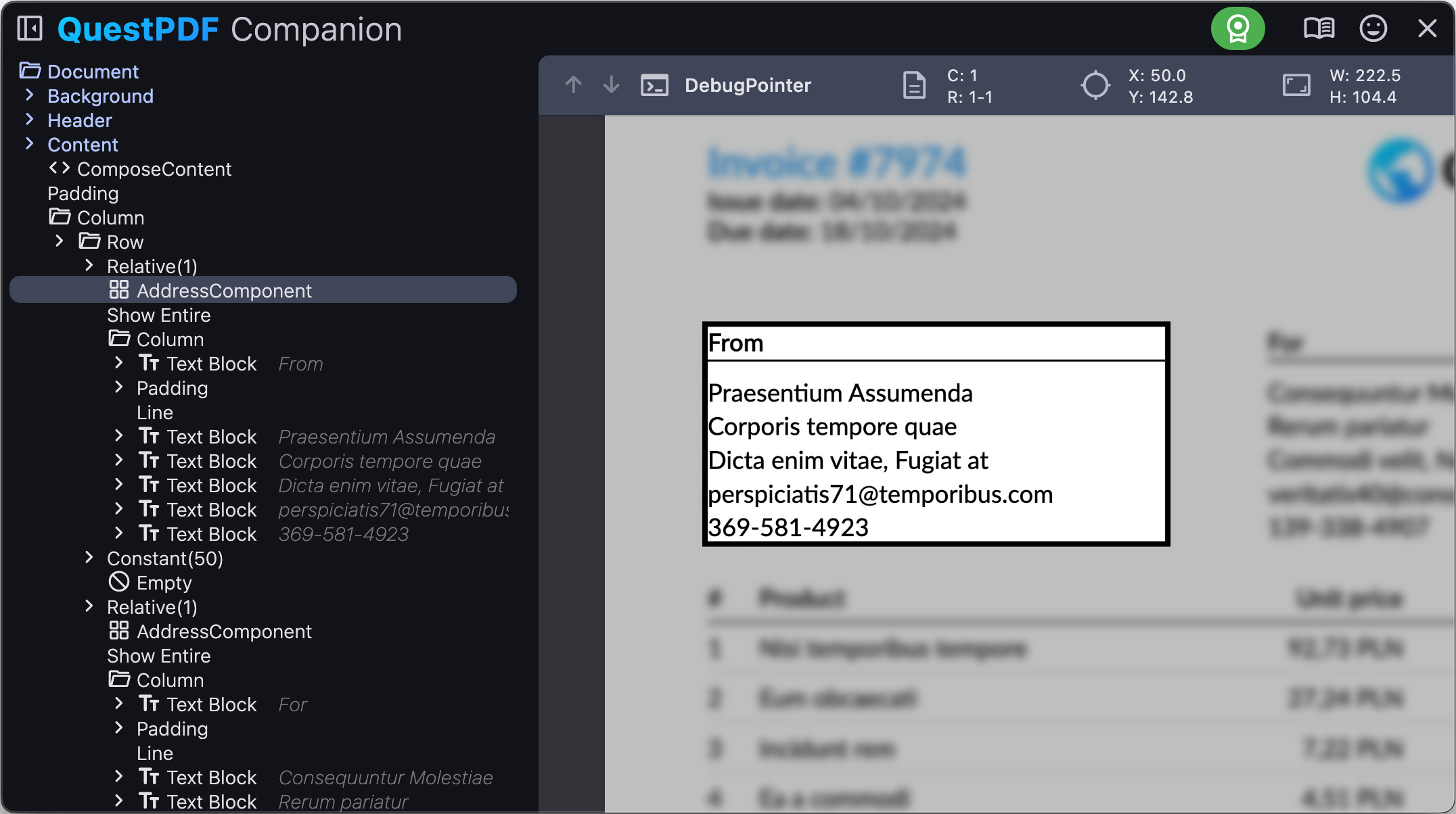
To select an element in the document, click on it in the document hierarchy section, or double-click on the content displayed in the document preview section. The selected element is highlighted in the preview.
Once the element is selected, you can review its details in the appropriate panel, such as configuration, position and size. If the element is visible on multiple pages, you can use arrows keys to navigate between all occurrences.
| Shortcut | Description |
|---|---|
| arrow up | Previous element occurrence |
| arrow down | Next element occurrence |
| esc | Clear element selection |
Content searching
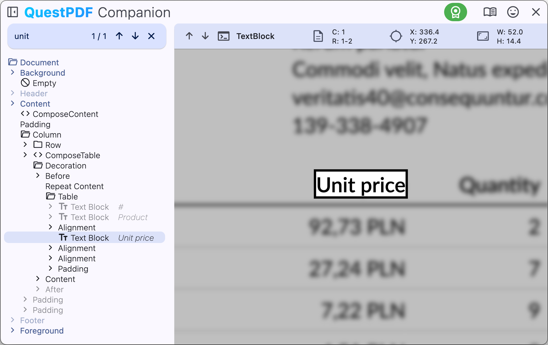
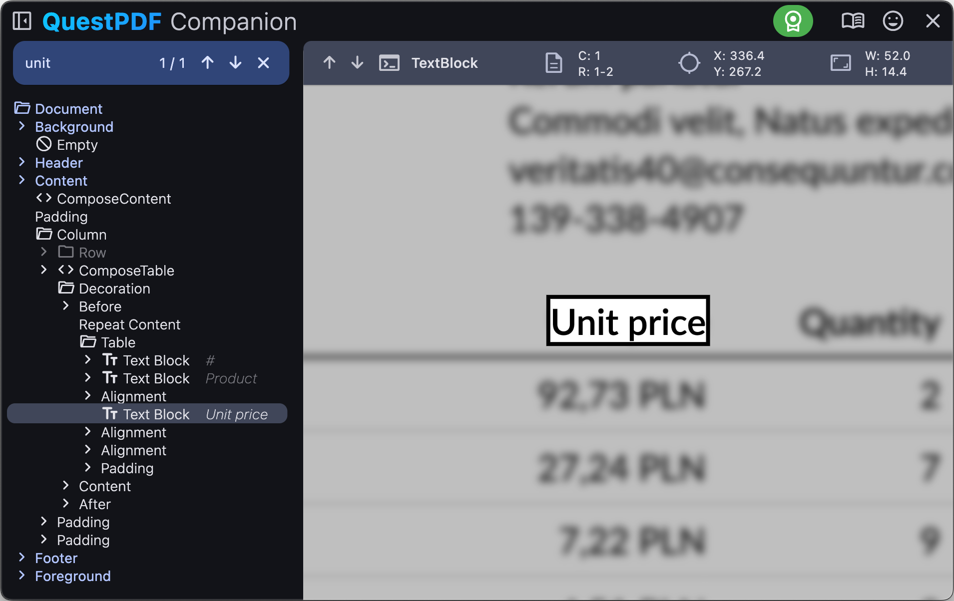
Quickly navigate the document content by searching for a specific phrase. To search for a phrase, press ctrl + F. The search bar appears at the top of the structure tree view. Enter the phrase you want to search for.
The selected search result is highlighted in both structure tree view and on the document's preview. You can navigate between the search results using the arrow keys (up and down).
| Shortcut | Description |
|---|---|
| ctrl + F | Search by phrase |
| esc | Exit search mode |
| arrow up | Previous found element |
| arrow down | Next found element |
Go to implementation
The companion app allows you to quickly navigate to the implementation of the desired area in the code editor. To do this, hold the ctrl key and click on the desired area. The code editor will open with the implementation of the selected area.
WARNING
The hot-reload feature may limit the accuracy of this feature. The first document load produces the most accurate results. Hot-reloaded documents provide less precise navigation.
Document links
The companion app allows you to open links in the document. To open a link, hold the alt key and click on the link.
There are two types of links in the document:
- Hyperlinks: links to web pages open in a new browser tab,
- Section links: links to sections in the document move the preview to the target section.
Runtime exceptions
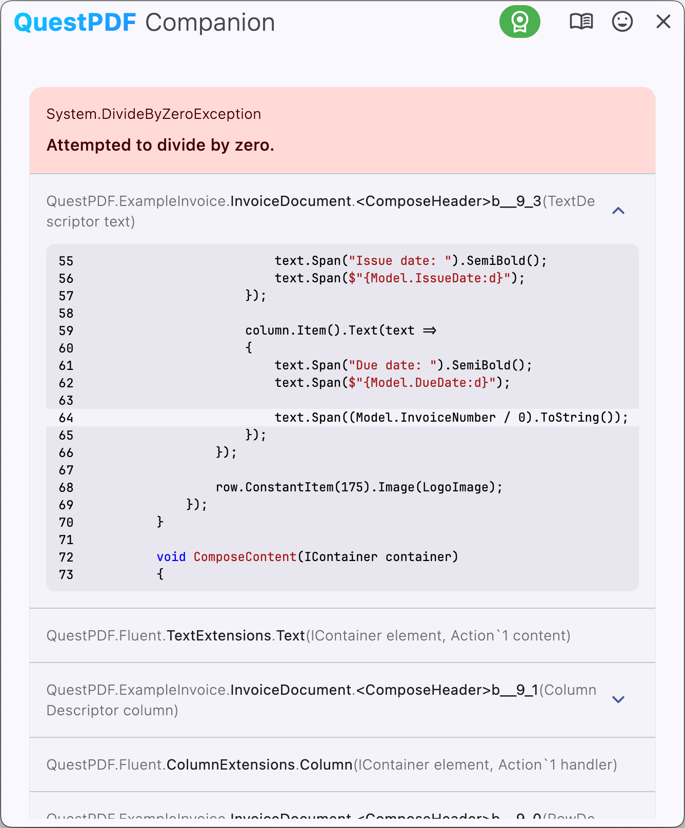
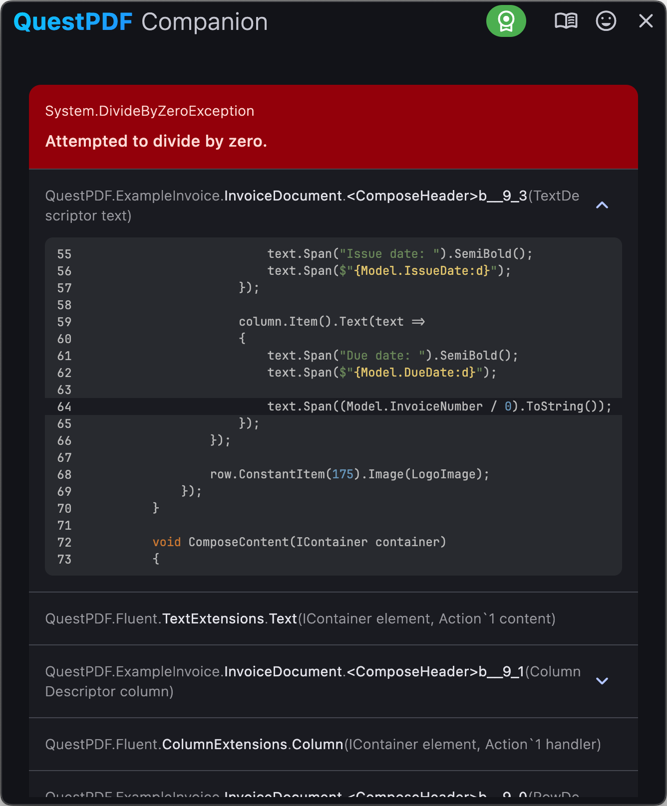
The companion app provides a detailed view of runtime exceptions that occur during document generation. The exception details are displayed in the error panel. You can review the exception message, stack trace, and the source code that caused the exception.
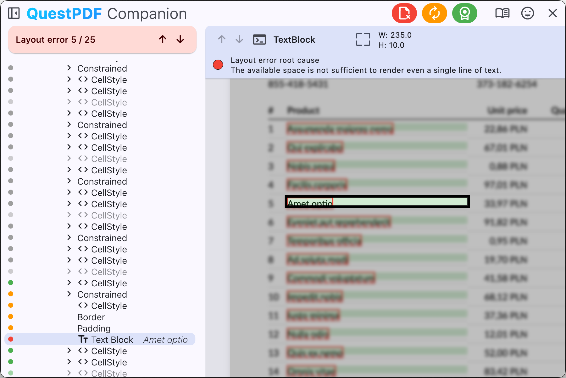
Layout issue debugging
In case of layout issues, the companion app provides a set of tools to help you identify and resolve the problem.
If a document contains multiple layout issues, you can navigate between them using the arrow buttons (up and down).
Each element in the document structure view will be annotated with a color-coded dot with the following meaning.
| Color | Meaning | Description |
|---|---|---|
| Layout issue root cause | Element that is likely the root cause of the layout issue based on library heuristics and prediction. | |
| Wrapped | Element that cannot be drawn due to the provided layout constraints. This element likely causes the layout issue, or one of its descendant children is responsible for the problem. | |
| Partially rendered | Element that can be partially drawn on the page and will also be rendered on the consecutive page. In more complex layouts, this element may also cause issues or contain a child that is the actual root cause. | |
| Fully rendered | Element that is successfully and completely drawn on the page. | |
| Empty | Element that has been drawn on the faulty page but took no space. | |
| Not rendered | Element that has not been drawn on the faulty page. Its children are omitted. |
When an element is selected, additional information about the layout issue is displayed in the element details panel. You can review the reason for the layout wrap or layout overflow. Use that hint and your knowledge about structure elements behavior to resolve the layout issue.
Settings
The companion app provides a set of customization options to adjust the appearance and behavior of the previewer, including:
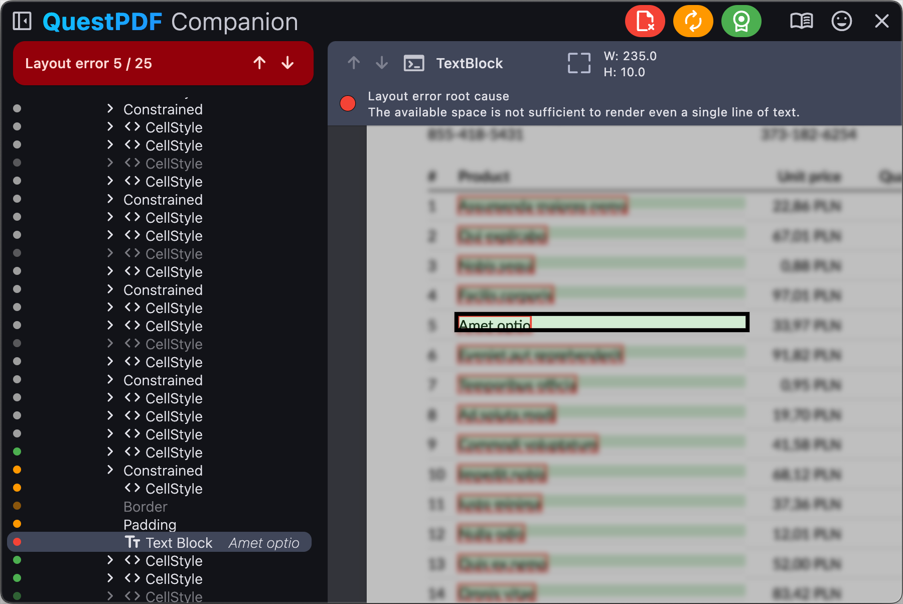
- Light and dark theme,
- Default IDE for code navigation,
- Changing port number on which the application will communicate.
